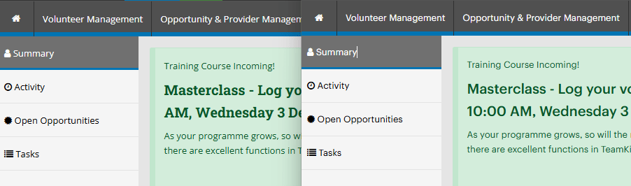
Its time again already for a supercharged new release from TeamKinetic. This release focuses on the volunteer experience with a brand new, entirely revamped and nicer looking interface.
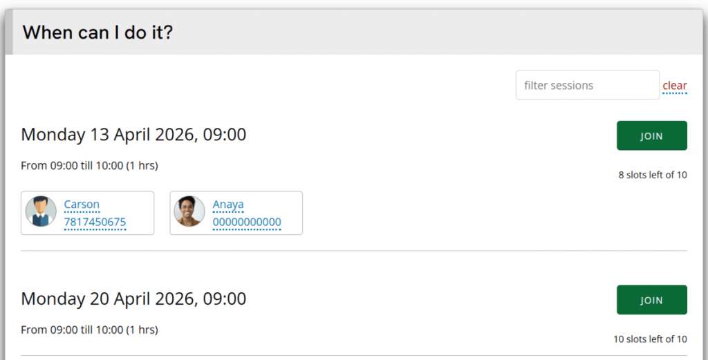
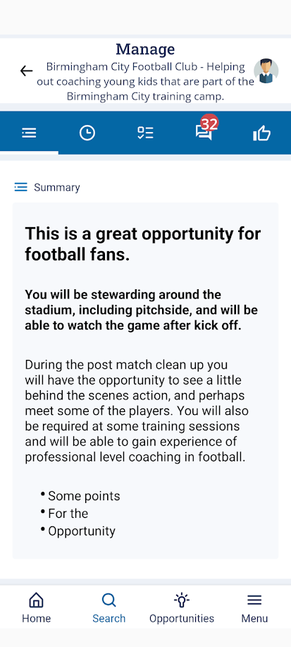
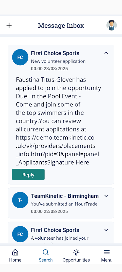
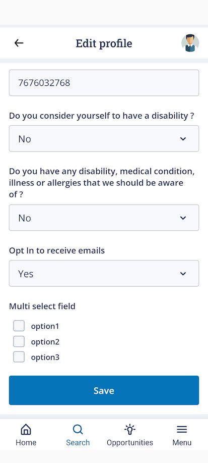
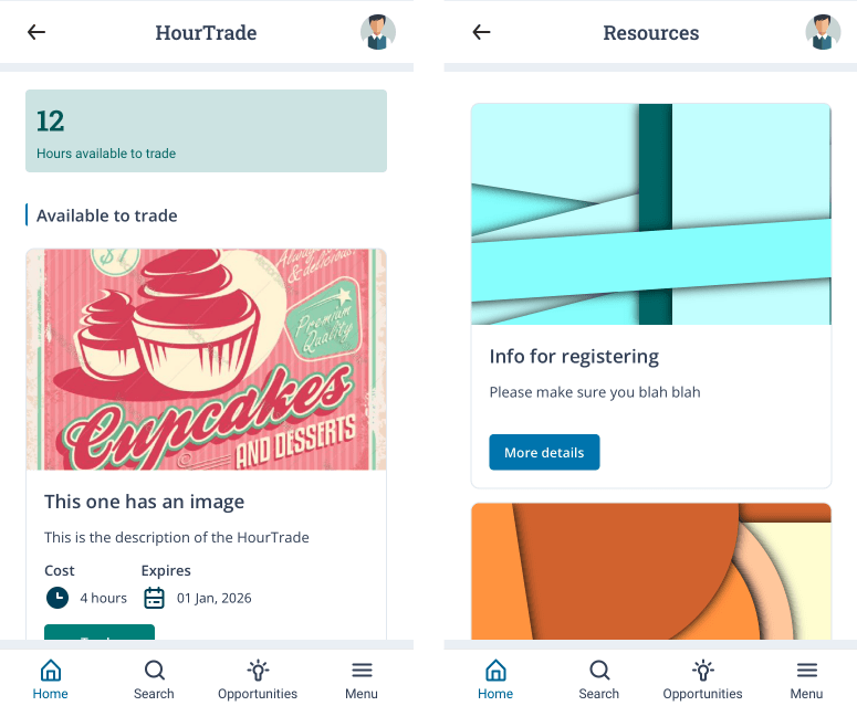
Brand New Volunteer Interface
It combines all the great functionality that volunteers had access to in a familiar way but improves all aspects of the look, feel and experience. We have maintained our high standards of accessibility but at the same time upped the small and friction free interactions that make you go ahhhhhh.
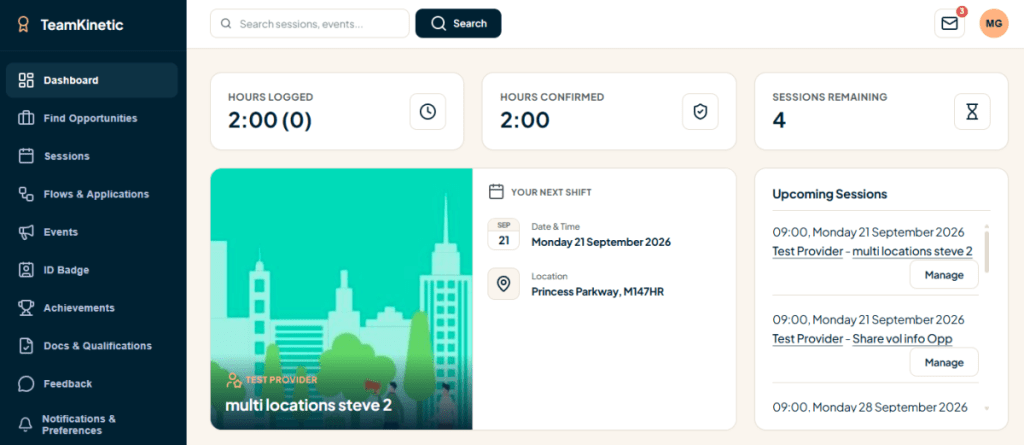
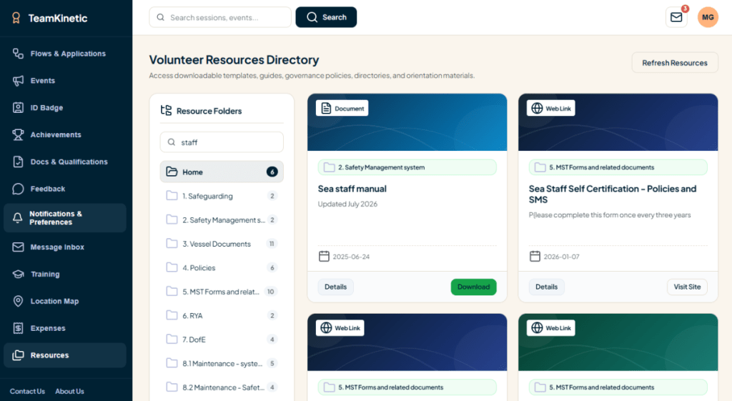
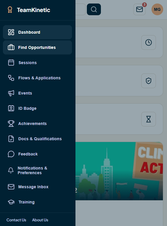
The new look is not just skin deep either, we have added plenty of quality of life improvements, even if the foundational functionality is still the same.
You can now easily search through all your messages, search your resources, update expenses and resubmit expenses; more on that later.
We have also spent a lot of time improving the experience on mobile devices with touch sensitive sliders and scrollers, reactive scrollable tables that wont break the layout and an improved navigation and menu system.
You may notice the feedback section also has some extra knobs and whistles which we’ll cover later.
New Day Schedule Report
For those of you that run events or have days with many sessions all cramped in, the new day schedule report is going to help you massively.
We are still actively developing this and getting some fantastic feedback from users and you can give the beta version a go right now straight from your own day schedule reporting page.
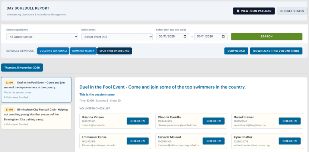
The key areas we were trying to improve were overview, ease of checking in volunteers and getting all the info you need without having to open overlays. The old version of the layout is still available in this beta version for comparison.
We also realised that not everyone has the same configuration of sessions across days so we have provided two alternative layouts that each offer a different experience.
The matrix view is fantastic for seeing everything at once; all the sessions (with names) are down the left hand side and all the volunteers on each of those sessions on the right.
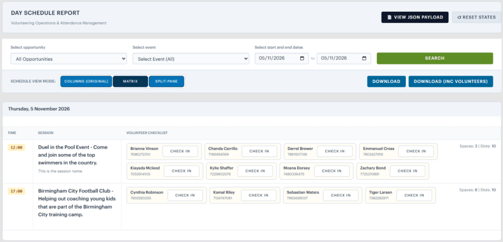
It might be a bit much though if your sessions have lots of volunteers, rather than lots of sessions. So we also have the split-pane view. This view breaks down into each day, so you see all the sessions on that day and all the volunteers. Great if you only want a single day overview and also if you have lots and lots of volunteers, which might make the matrix view a little unweildy.
In both cases you can quickly and easily tell what volunteers are where and check volunteers in and out. Let us know what you think and any suggestions you have via support ticket.
Provider User Update
Originally TK only allowed a single login for each provider, and these details were stored in the provider record. You will all be familiar with this layout and you can update this central login from the provider profile pages.
We have now supported multiple users for each provider for a few versions now so its time to retire that central login that causes some confusion sometimes.
From 2.8.0 onwards every provider account will have a contact name and contact email address to connect with the provider organisation, but will have no login assoaciated with it.
All provider users logging on will use their individual provider user accounts. These have a already been created for old provider accounts. Newer accounts in the last year or so have had these user accounts created when the provider registered.
We hope there is minimal disruption, but any provider that can’t login due to a password mismatch can simply use the reset password link on your provider login page to get going again.
Feedback Improvements
As you might have noticed on the new volunteer interface, volunteers can now add to their feedback in a proper feed so the updated are independently stored and dated and not just appended to the original feedback. The volunteer can also update the original feedback.
This same functionality will also be available for providers if they want to add to the feedback for long running opportunties.
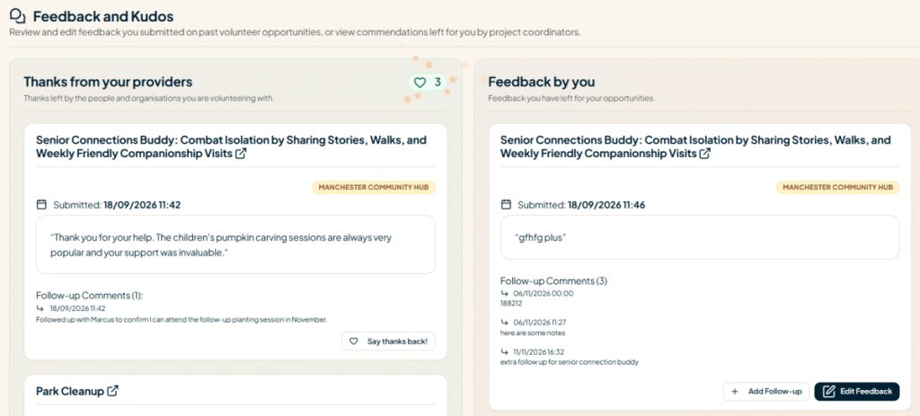
We have also added a little heart icon for volunteers to say thanks back directly for any feedback or kudos a provider sends their way.
Better Expenses
Volunteers can now update expenses and do not have to delete and recreate if they make a mistake – hooray! Editing is only available if the admin has not started processing the expense yet. It is already being processed the volunteer will have to contact the admin to make changes.
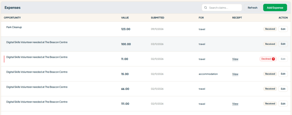
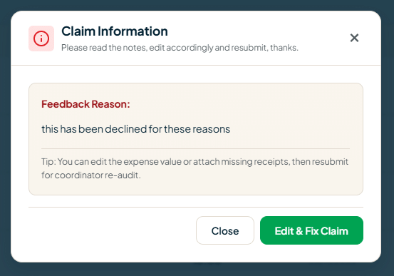
For administrators, you can now optionally mark a refused expense as re-submittable. You can explain why the expense has been refused and feed it back to the volunteer…they can read the reason and update the expense claims accordingly, like providing a receipt.
As with resources and messages, volunteers can now quickly search through their expenses.
More Filters – Always more filters!
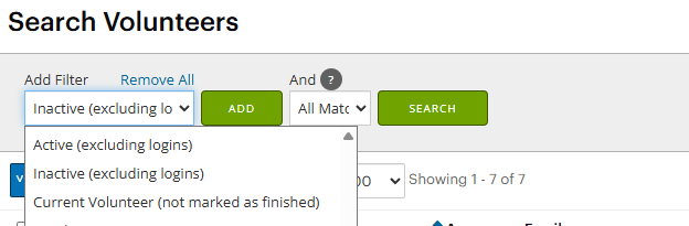
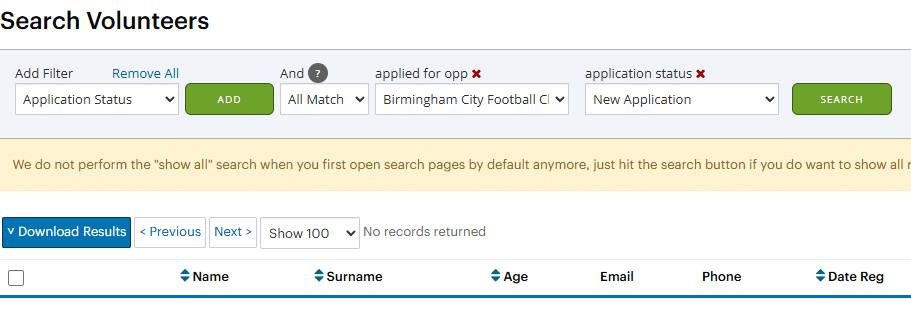
You can now find applications in particular statuses in particular opportunities by combining the old application status filter and the new applied for opportunity filter.
More Useful Flow Step Information
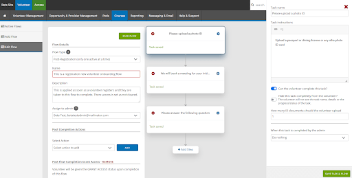
Since the first iteration of the flow step we have added quite a few options and extra functionality. The original flow step info box hasn’t caught up! We rectified this with a couple of quality of life improvements.
The volunteer visibility of the step is now shown in the step info box when building a flow and dynamically when processing a flow application.
We have also added an info panel letting you know if a step visibility is dependant on the completion of another task and what that task is.
There is now a more visible colour change for the step statuses; the entire header section for the step is coloured red (incomplete), green (completed by admin) or yellow (completed by volunteer).
Finally…
There has of course been the usual raft of minor annoyances and bug fixes and some efficiency improvements to help keep everything running smoothly.
The latest penetration test has been completed and is available on request. We received zero critical and zero high notifications.