I have been concentrating on accessibility improvements and changes for the upcoming 1.3 release of TeamKinetic and I thought I would give a little background into what accessibility means for websites and what TeamKinetic have been doing to solve some of the issues in a non-technical post.
It’s a long post but here’s a quick check list of what the focus has been for this release;
- Clear focus effects so a keyboard users knows where they are at all times
- Keyboard accessible menu and sub menu
- Keyboard accessible help tips, activated by the return key and closed by switching focus
- Proper use of ARIA tags for all content that is initially invisible (such as help tips, pop up windows etc) so that screen readers will correctly read out the revealed text at the correct time
- Correctly labelled form elements so that screen readers can always associate an input (such as a text element) with its description
- Grouping together of associated form elements using fieldsets and legends. For instance, a collection of checkboxs for a yes, no, maybe, definitely answer. using a fieldset ensures that a screen reader user knows what question the answers belong to.
- Keyboard accessible skip to content links that enable keyboard users and screen reader users to skip the menu and header portion of a webpage and get straight to the important stuff. Can you imagine how tedious it is to have to listen or tab through every navigation element on a webpage before you can read its content!
- Correct description tags (alt tags) for all images
- Improvements to link and button text by providing additional screen reader only text to give context to the link or button.
- Making sure all password fields are marked as ‘new’, ‘existing’ or ‘repeat’ as they are often just labelled password.
- Ensuring all webpages are accurately and uniquely titled and described.
Accessibility is often low on developers priority list, its understandable, the number of customers using assistive technologies is likely low compared to the numbers that do not. However the impact on those user that do, is enormous and by ignoring accessibility issues you are effectively blocking those users from accessing your content.
Although being able to access your website is a right for assistive technology users, and it is illegal to discriminate against such users, its also a positive process and a way to learn new skills, engage with a new audience and improve the intrinsic worth and value of your product.
Keyboard Accessibility
Keyboard navigation is perhaps the most important aspect of accessibility for websites. Navigating via a keyboard or something similar is employed by many users with mobility issues that cannot hold, move or control a mouse and also by many visually impaired users.
Keyboard users navigate through a website using primarily the tab key which focuses on item to item in the web page in the order it is served or in a specific order set by the website itself. Whilst focused on any element they can use keys such as the return key to activate the actions of that element, say a button to submit a form or to follow a link.
TeamKinetic enables keyboard navigation and all elements are focusable by the keyboard. There is a clear visual clue to which element is currently focused by the keyboard.
Menus
Its almost entirely universal that a website or application has a menu to quickly access different parts of a system. Its also very normal for the menu to have sub menus that are revealed when the mouse is moved over the heading (this is called a HOVER). As you can see below on the TeamKinetic menu the mouse pointer has been hovered over the menu heading and the sub menu is revealed.

But when a keyboard is used to navigate to the menu item the event is called FOCUS, not hover. If the website does not include the specific code for what happens when a menu element is focused by a keyboard event the user will not see the sub menu or any change in colour/appearance to indicate where in the menu they are.
TeamKinetic’s menus are now fully accessible by the keyboard with visual indicators of where the current focus is. When the focus is on an element with a sub-menu available there is a clear colour change and by pressing return the menu can be toggled on and off. Importantly, if the menu is not activated with the return key the user does not have to navigate through all the items of the sub-menu in order to reach the next item in the current menu.
Skip Links
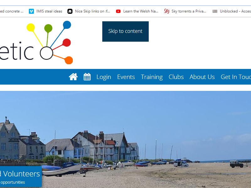
Skip links are a very important and hugely convenient addition for accessibility. They are hidden links or buttons that a screen reader or keyboard user will expose that enable them to skip past all the header and navigation elements that are the same on every page.
Help ToolTips
Tooltips are little bubbles that pop up to give the user more information or context about a feature or action. Traditionally these have activated when the mouse is hovered over the target and the tooltip disappears when the mouse is moved away from the target.
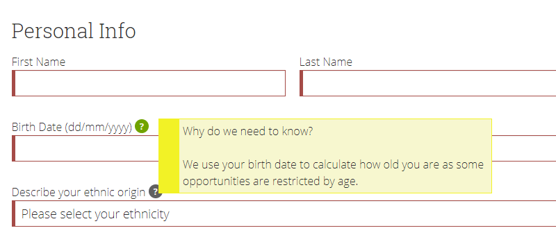
This is problematic for keyboard users that never fire the hover event, only the focus event (see above) that will never see the tooltip and also for users with reduced motor control. We have converted all our volunteer help tooltips into an accessible form that will fire when the question mark is clicked or when it is focused by a keyboard user. To dismiss the tooltip you move the focus either by pressing the tab key or clicking the mouse anywhere that is not the question mark icon.
importantly the new help tooltips are also labelled carefully with the appropriate ARIA tags so that screen readers are alerted to the presence of new information and are aware when they reach the question mark icon that this will reveal new information when activated and can map the
Improved form labelling
For screen reader users it is important that the context and purpose of all form elements, like text boxes, checkboxes and buttons is clear from the element itself. It is easy for a visual user to tell which question a form element belongs to as it will be group visually, or perhaps via certain colours, on the screen, but will not be apparent to a screen reader user.
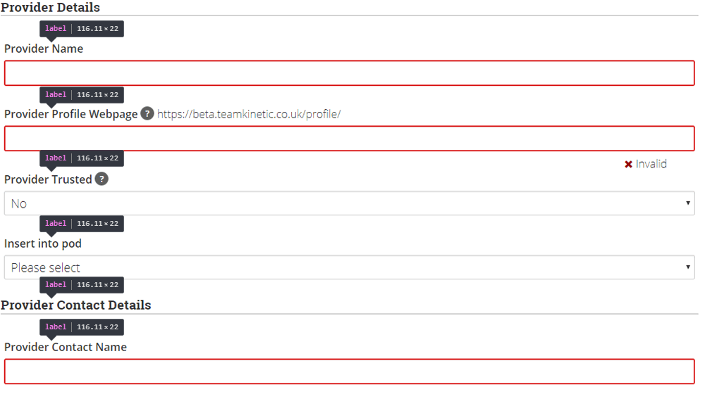
We have redesigned all the volunteer forms to make sure that the extra context required for screen reader users is included. We achieve this through judicious use of the LABEL tag for describing form elements, by grouping associated elements in a fieldset with a legend and by improving the quality of link and button text by included hidden text that only screen readers see.
Extra Screen Reader Context
Using special styles, it is possible to hide text from visual users but expose it to screen reader users. This is great for adding additional context to buttons and actions that make sense visually but are indistinguishable for screen reader users.
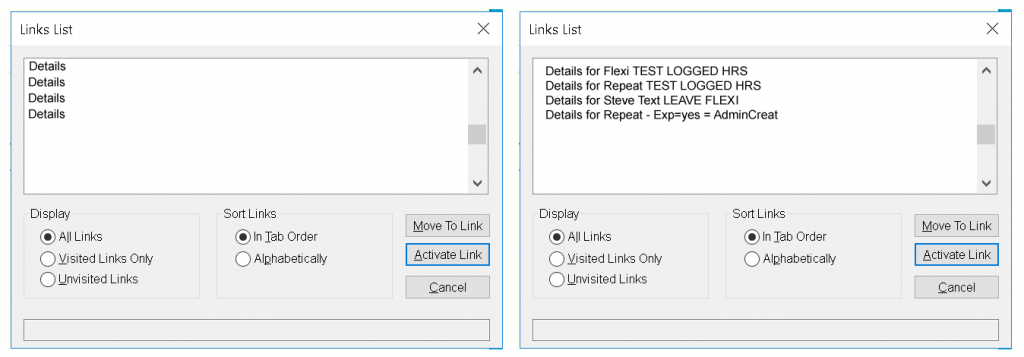
Imagine a long list of say opportunities, each with a button/link that says ‘More Details’ that you might encounter on the search page. It’s easy for a visual user to match the same identical button or link with the context of the opportunity you are currently looking at but not for a screen reader that will just list a long set of identical buttons.
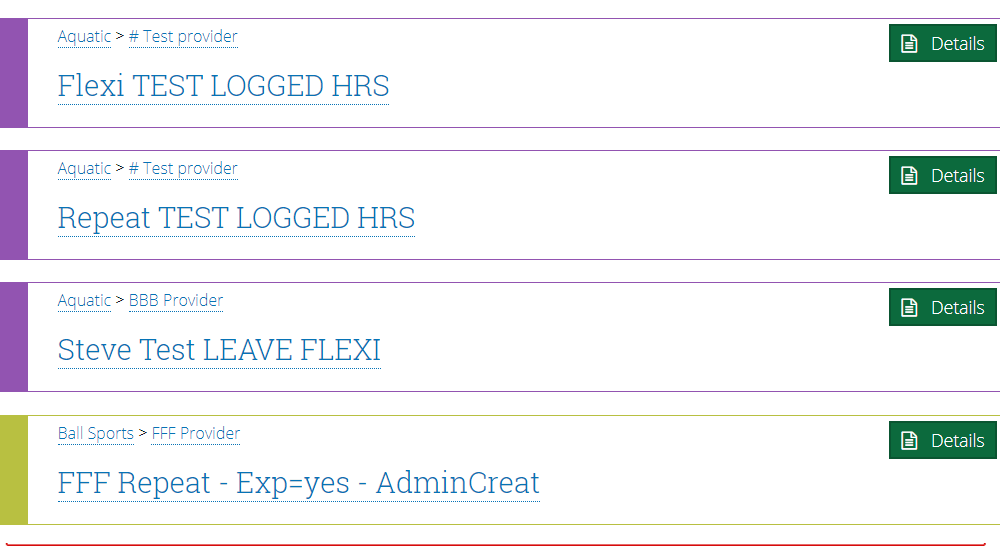
The addition of the contextual text means a screen reader user knows, in this case, which opportunity is linked to which button.
What Next ?
Most of the work for this release has been focused on the volunteer’s portal, with some global changes, like the accessible menu applied across the application.
We will be auditing all the provider pages to perform the same changes as above and finally onto the administrator pages.
We envisage that we will be constantly improving accessibility as best practise evolves and we discover new areas that are not optimised for assistive technology users. If you are such a user we would love to hear your experiences and suggestions.

4 Pingbacks