We have some pretty extensive reporting and filtering tools in TeamKinetic so we thought it was time we talked about them a little. We have also published a full list of the reports that we will endeavour to keep updated as new ones are added.
Most of our reporting and insight tools still live in the reporting tab but there are little nuggets of useful information you can use to gain insight sprinkled throughout the application.
First lets go through the major reports available from the Reporting > Reports & Analysis menu.
This area is split into themed sections. Each section is limited by the entered dates, although there are some all time stats at the top of the page.
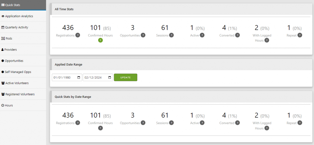
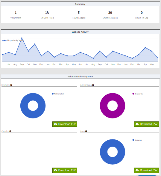
The all time totals give a very clear overview of your volunteer program and can be used to identify possible issues for volunteers being able to join opportunities. The figures from left to right follow the flow of volunteers through the system, from registering, joining opps, attending and logging hours to repeat volunteers that have joined multiple opportunities. The closer these numbers are to each other the better your programme is performing and the higher your retention and engagement rates.
Quick Stats gives you the number of registrations, active volunteers that have been on at least one opportunity session, number of logged hours, number of opportunities that have an available session, total sessions and the average age of volunteers. All these figures are restricted by the date range selected and give you a smaller window on the all time figures.
The analytics data lets you see how many people are visiting your application, you can drag across the graph to zoom in on any period and roll your mouse over any point to get more information. Watching your traffic ebb and flow can help you gauge the effectiveness of any promotions or engagement activities you have been running.

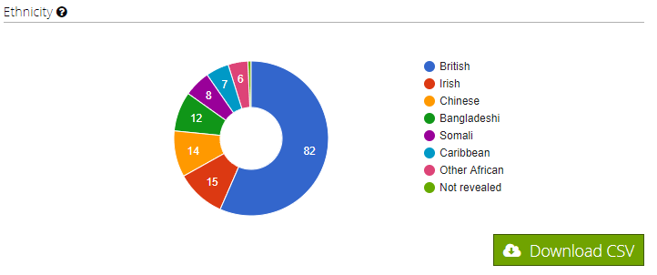
The volunteer section breaks down your volunteers; you can view them by ethnicity, age, location, group membership and others. In all cases you can roll over the charts to get more information and also download each report individually for offline analysis.
The quarterly report is a handy tool that summarises volunteers, hours, and sessions into the regular yearly quarters, starting each year in April. For many charities and organisations these are the key figures they need to report each quarter or year. These figures are not affected by the selected date range instead they also show the current and previous year totals.

The opportunity reports give you all the information you need about your opportunities, their distribution, performance etc.
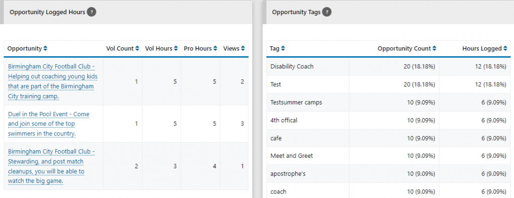
The website search chart tells you what your volunteers are searching for which can help focus and drive your provider and opportunity recruitment. The tag count table shows you which opportunity tags are proving the most popular, both in terms of how often they are used and how many hours are logged against opportunities with that tag. The fulfilment table gives you the insight you need to discover which opportunities are under performing and which are flying. This can help drive your advice and procedures for creating opportunities and enable you to identify the possible reasons that some opportunities fail to excite or attract volunteers.
You’ll find lots of charts and graphs with all the
You can find out quickly which sessions are under-subscribed, how many TeamLeaders are signed up for a session, and which volunteers are due where. The view is ordered by session date by default but you can re-order by opportunity or number of empty slots. If you need to know whats going on at any one time, this is the report you need.

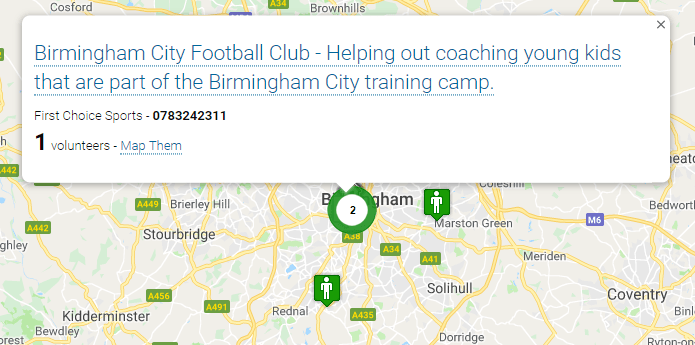
The mapping reports are great fun but also impart some important qualitative data. You can map out all your volunteers and opportunities and get a good feel for the reach of your programme and where it is having the most impact. You can quickly identify the hubs of volunteering activity.
Finally for the main reporting area, if you want to interrogate your data offline you can use the download data area to grab all your volunteer, provider and opportunity data as CSVs. If you want to extract particular information our enterprise version also includes API access so you can export data to your chosen CRM or in house systems.
As well as the reports found here the administrator dashboard contains some useful insight and tools for guiding your actions.
The summary tab shows the most important daily tasks you’ll need to keep on top of, such as authorising new volunteers and opportunities, but it also provides a scrollable aggregated list of whats happened since you last logged on. This includes registrations, new opportunities, logged hours and many other events.
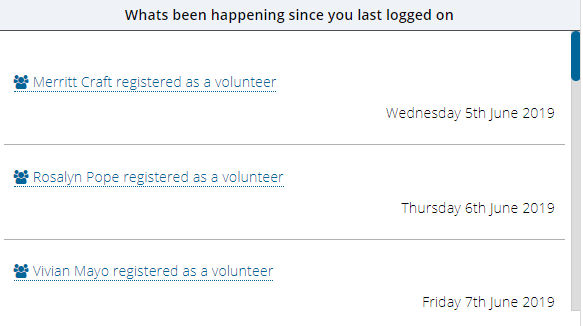
The activity tab separates out the events that have happened in the last 30 days to help you keep on top of your programme.
The tasks tab tries to identify potential issues before they become real issues; hours that have not been verified and providers and opportunities that are under performing or not engaged.
Administrators will also find reports that are scoped just to the volunteer or opportunity being managed. So when viewing an opportunity you’ll see how many times it has been viewed by a volunteer, or you can see how many hours a volunteer has logged in different groups or categories when viewing their profile.
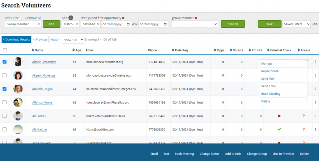
We have also added some great filtering and searching tools for volunteers and opportunities which you can save and use again and again to build your own custom report. You can layer different filters on top of one another and use an AND/OR clause to really drill down on your volunteers or opportunities.
If you’ve got this far, well done and thanks for staying with me! If you find you cant get what you need from our reporting, or you have very specific questions that need an answer, we can also build custom reports that you can access anytime from your reporting menu. Please get in touch.

1 Pingback